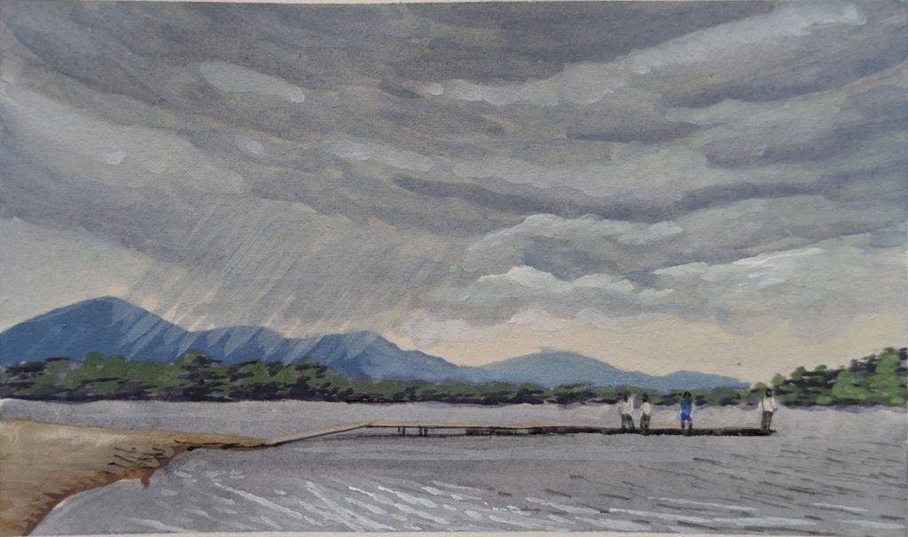
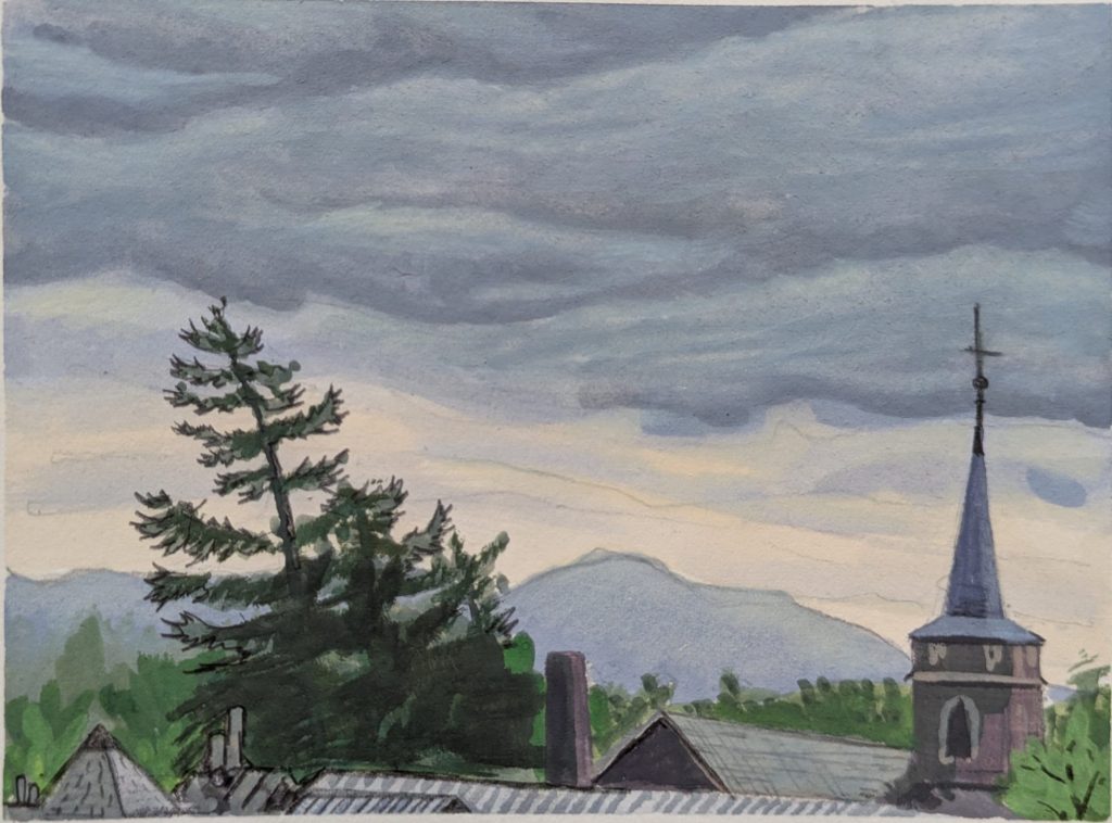
A few new plein-air paintings to share. I turned 40 this year, and to celebrate we spent a long weekend in Lake Placid. It was wonderful. The first two days were overcast and drizzly, but I still managed to get two gouache paintings in. The last day was absolutely gorgeous so we spend the day enjoying the weather and climbed Owl’s Head.
Gouache is my go-to for travel painting; it’s simple, portable, and fast. A tray of paints, a cup of water, and a brush. Thank you, wifey, for loaning me your empty coffee cup when I forgot a water cup.
The trickiest part is that gouache changes so much as it dries. The water really whitens the wet paint mixes on the pallet, but then they dry several shades darker on the page. That makes tonal balance surprisingly difficult, especially when you go back to a passage and try to match something “just a touch lighter” than what is already there. You have to mix a color that looks much too light while it is wet and trust that it will land in the right place when it dries. This makes gentle gradations and blending – elements that usually dominate the sky – particularly tricky. And it makes it very easy to end up tonally too dark overall (my feeling on both of these paintings)
Acrylic does this too, but not as dramatically. Oil paint is the opposite: it stays much truer to its wet color, which is part of what makes it so ideal, and part of the reason oil painters can achieve such beautifully perfect skies. In my experience, gouache is by far the worst offender. But as is often true with art – the challenges any particular media are what often define the distinct appearance of that media – and the distinct charm of that media as well.
And then I have a new plein-air painting from back home.
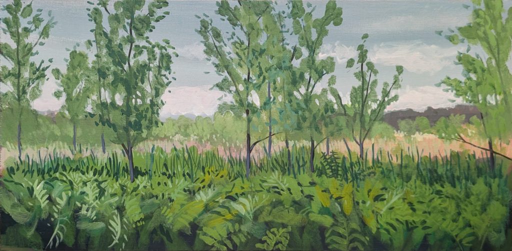
I’m on a constant hunt for painting locations, and this is one I’ve been eyeing for a while. Behind Averill Park High School, beyond the track and baseball fields, there is a wetland we first spotted while hunting for morels. Wetlands are great natural environments for painting, and this one has the critically important feature of walkable access from a public parking lot.
I initially thought I would do a little painting — maybe 4″ x 6″ — because of time constraints. But on a last-minute whim I grabbed a larger prepped board, something around 10″ x 20″. I love big paintings. They have so much more visual impact. But they also take more paint, which means more time spent mixing colors. When you only have 60 minutes or so in the late evening to capture a scene before the light changes dramatically — and sunset happens fast — spending most of that time mixing a color to get it just right can be frustrating. It can also leave you with an awkwardly unfinished piece.
The other thing that slows a painting way down is simply covering area with the brush. So a big painting requires a big brush. I grabbed one of my few 1″ bristle brushes on my way out the door.
I usually spend some time drawing the large shapes of the scene onto the board with a water-soluble colored pencil, just so I know how everything is going to fit. But I knew this would be a race against time, so I jumped directly into mixing and covering the canvas. My goal was to get every inch covered in a base color as quickly as I could.
By “base color,” I mean the darker shade inside each large block of the scene. For example, if the far distant hills are a dark purple with lighter green on top defining the tree shapes, the base color is dark purple. If the foreground is ferns — bright greens, white-greens, deep greens — I’m actually looking for the color between the ferns. In this case, that was a very-close-to-black purple. That’s the base color.
I blocked the whole image in that way, quickly. That sets the overall tonal harmony of the painting. From there, I’m painting where the light hits and slowly lightening the painting up, filling it with light as I add layers over the top.
I think of it almost like printmaking: what colors would I use if I could only do three layers to communicate the foreground ferns? This is basically a light-over-dark method. I’m not dogmatic about it. I’ll often go back in with fresh darks, especially later in the painting. But it is a strong, fast way of arriving at a stable foundation.
One thing about me is that I have red-green color deficiency. Not color blindness — I can definitely see red and green — but I have a limited ability to sense the more subtle hues. Often I’ll think things are brown, gray, or blue when they are actually red or green. I am certainly deficient compared with my wife who helps me with what’s what.
I’ve always wondered what this means for the way other people see my paintings, especially a painting like this one, which depends so heavily on subtle variations of green. I’ve been told before that I paint my greens “uniquely” compared with other artists — in an identifiable way. Can you see that here? I also find that pigment mixtures to achieve green are so limiting (remember that actual physical painting is constrained by the lightfast pigments that have been discovered). Greens in nature are so vibrant (the light is shining through the back of those fern leaves in the foreground) – it requires visual trickery to even come close.
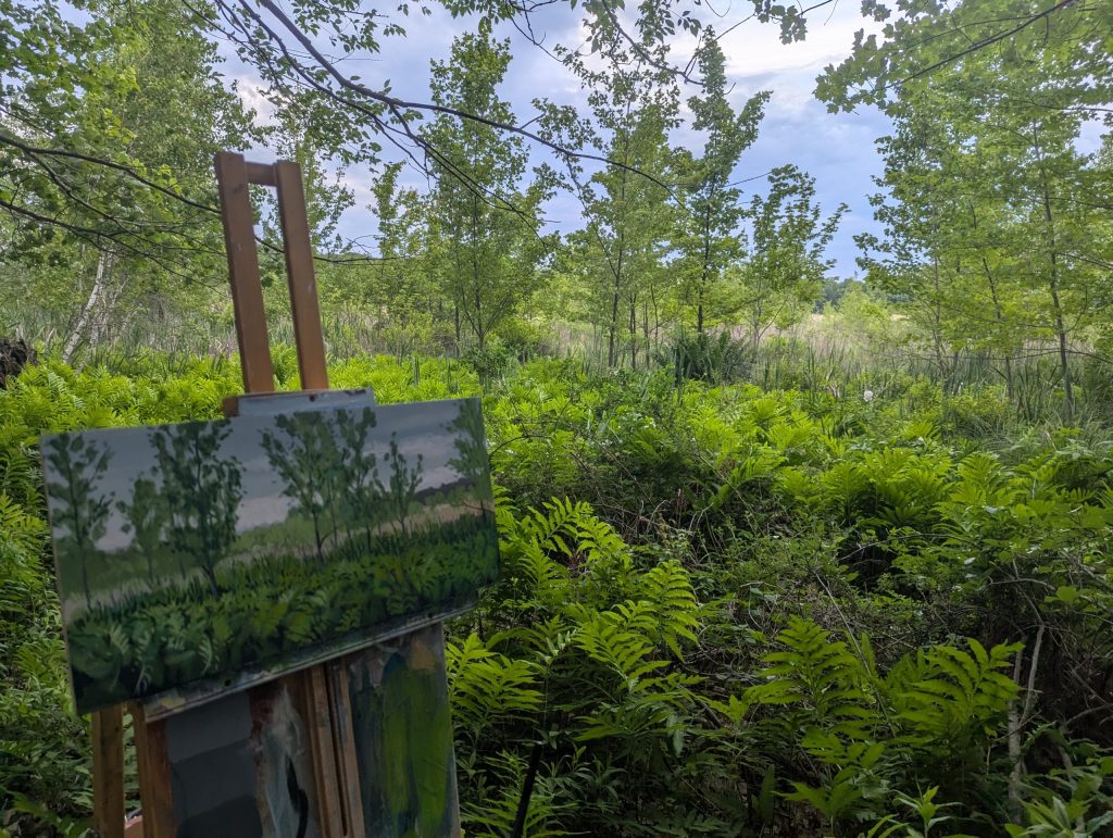
Anyhow, enough painting theory, here’s the work in progress and view from my easel. Thanks for being subscribed!!